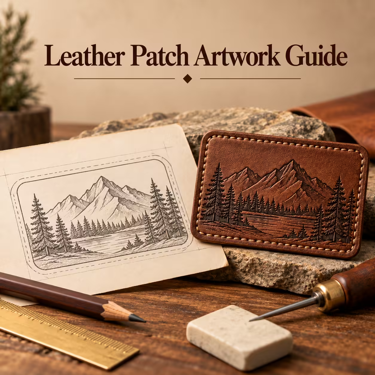
Leather Patch Artwork Guide
Leather patch artwork is clearest when supplied as clean vector paths with outlined text, a defined cut contour and dimensions. AI, EPS, SVG and vector PDF files can preserve geometry, while photographs and other raster images require enough resolution at the actual print size.
On this page · 14 sections
- Best File Formats for Leather Patch Artwork
- Raster Artwork and Resolution
- Convert Text to Outlines
- Minimum Line Width
- Small Text and Legibility
- Negative Space
- Artwork for Debossed Patches
- Artwork for Embossed Patches
- Artwork for Laser-Engraved Patches
- Artwork for Printed and Colour-Filled Patches
- How Digital Proofing Works
- Common Artwork Problems
- FAQs
- Turn the details into a clear specification
Best File Formats for Leather Patch Artwork
Vector artwork describes shapes as paths and can be scaled without introducing pixel edges. AI, EPS, SVG and vector PDF are useful formats when they contain the correct artwork. A file extension alone does not prove that an embedded logo is vector.
AI
An AI file can preserve editable vector artwork. Check that any placed images are supplied and that production text is outlined where required.
EPS
An EPS file can carry vector paths but may also contain raster content. Inspect the actual logo geometry rather than relying on the extension.
SVG
SVG stores scalable paths and shapes. Remove unintended guides and check that the logo renders consistently without missing fonts or linked assets.
Vector PDF
A PDF can preserve vector artwork or simply contain a low-resolution image. Confirm the logo remains clean when inspected and keep the dimensions explicit.
Raster Artwork and Resolution
Raster artwork describes an image with pixels. Its useful resolution depends on how large it will be reproduced and the selected process. Enlarging a small screenshot does not restore missing detail; provide the highest-quality original and confirm production requirements.
Convert Text to Outlines
Converting text to outlines turns lettering into fixed shapes so a missing font cannot change the logo. Keep an editable source copy separately. Check spelling before conversion and inspect small letter counters after the final-size artwork is prepared.
Minimum Line Width
Minimum line width depends on finish, material and production capability. Both the narrowest stroke and the narrowest gap need review. Ask for limits for the chosen specification rather than applying one number to debossing, engraving and printing alike.
Small Text and Legibility
Small text remains legible when the letters have clear shapes, sufficient spacing and visible contrast. Remove decorative type features that disappear at finished size. Review the actual word rather than a generic font sample, because letter combinations affect the available gaps.
Negative Space
Negative space is the open area within and between artwork elements. It keeps letters and symbols distinct when a process softens their edges. Inspect enclosed counters, adjacent lines and the gap between the logo and border at final scale.
Artwork for Debossed Patches
Debossed artwork needs a clear distinction between recessed marks and the untouched face. Broad strokes and open gaps support a readable impression. Avoid interpreting a shaded mock-up as production geometry; provide clean shapes showing what should be pressed.
Artwork for Embossed Patches
Embossed artwork should identify raised features and the surrounding background. Leave enough separation for relief to read clearly, particularly around small letters and borders. Confirm whether a raised outline is decorative or also intended to guide stitching.
Artwork for Laser-Engraved Patches
Engraving files should separate artwork from cut paths and avoid accidental overlapping or duplicate lines. Fine detail still needs contrast and adequate scale. Identify critical elements and ask for a physical test when tiny lettering or scannable codes must function.
Artwork for Printed and Colour-Filled Patches
Printed artwork may use tonal images when the process supports them; colour-filled artwork needs clearly bounded fill areas. Supply colour references and show which areas use each colour. The two methods require different preparation even when the final mock-up looks similar.
How Digital Proofing Works
Digital proofing checks the planned layout, dimensions, orientation and specification. Compare the proof with the original brief, then inspect it at actual size. A proof cannot establish material feel, physical colour or application performance; those need the appropriate reference or sample.
- Match the proof revision to the quotation.
- Verify spelling, cut contour and dimensions.
- Inspect lettering and gaps at actual size.
- Check finish, shade reference, backing and variants.
- Record approval or request a clearly identified revision.
Common Artwork Problems
Common problems include embedded low-resolution images, missing fonts, unclear cut lines, overcrowded lettering and artwork crossing a stitch border. Check the file before sending it. Keep the approved version with its dimensions and material specification so revisions cannot be confused.
FAQs
Does saving a JPEG as PDF make it vector?
No. A PDF can still contain the same raster image. Provide original paths where they exist.
Why outline fonts?
Outlining preserves the letter shapes when the receiving system does not have the font. Keep an editable source copy separately.
Is there one minimum line width for all finishes?
No. Material and process change the limit. Confirm it for the actual size and specification.
Turn the details into a clear specification
Send your logo, dimensions and quantity with the design or application choices discussed above. Include the receiving product and any wash or delivery requirements so the quotation can address your intended use.